Join us on our journey of building Vogue Scandinavia’s forever home, from the bare foundations, to a space imbued with the beauty, innovation and craftsmanship of Nordic design
When fashioning a space with a rich history into our dream workplace, there is one thing we want to begin by doing: honouring its past. The story of the building, such as its time as ‘Tysta Skolan’ (or ‘The Quiet School’ in English) and the architecture of the surroundings we’re moving into, have all played a big role in its renovation.
Not only because the history of these rooms is important for us at Vogue Scandinavia, but because it is in part the story of how Scandinavian tastes and trends have developed into what they are today. And being in contact with where we came from, understanding the preferences that have taken root in our society (and now represent what the rest of the world perceives as ‘Scandinavian design’), is a big part of our choices.
Video by Rebecca Hyde-Price Aggestam
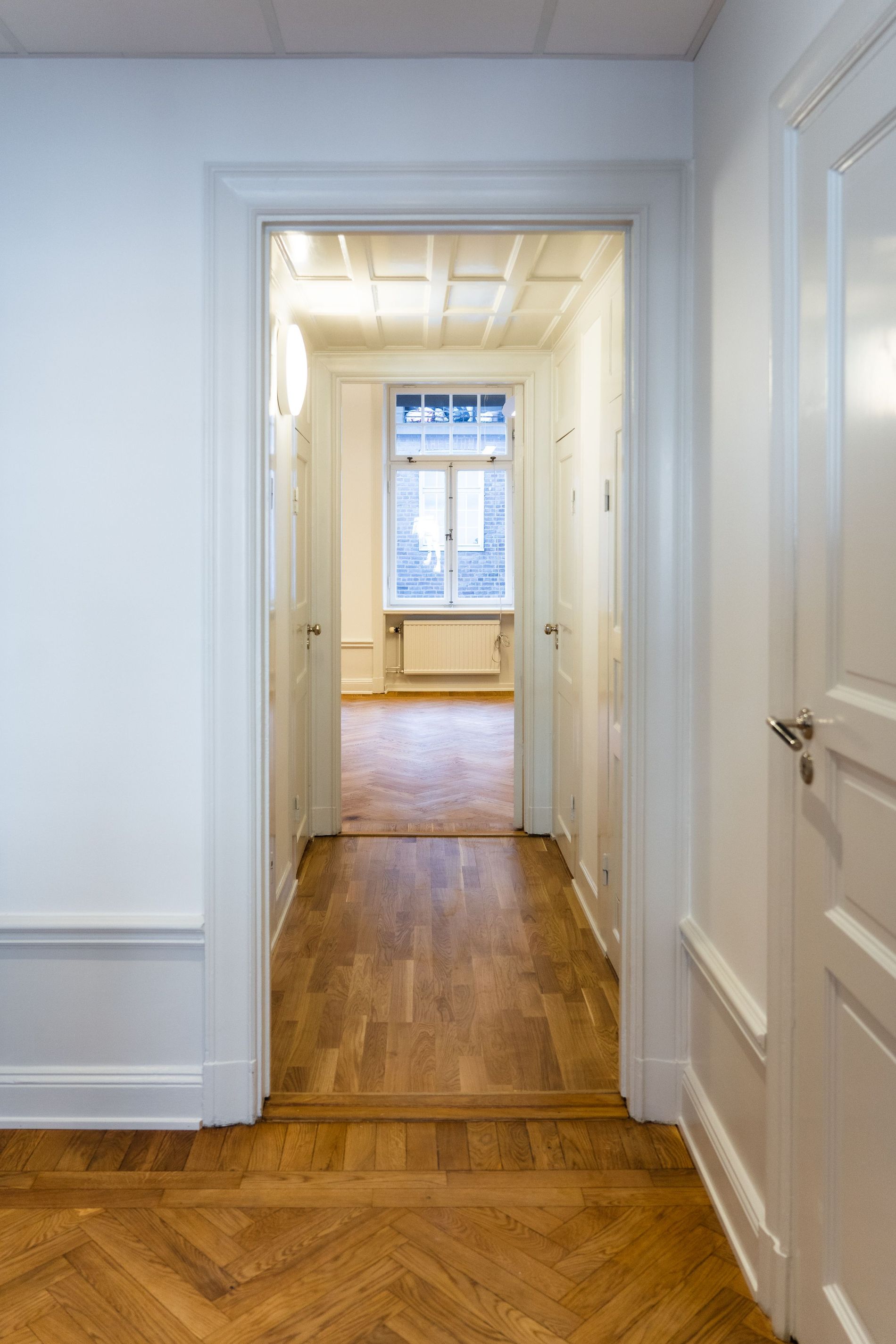
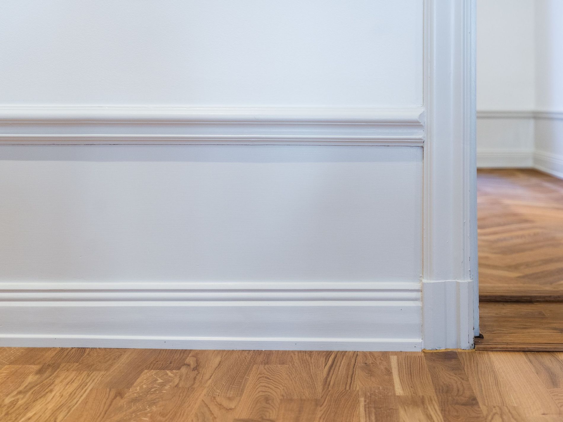
Trends are, as always, a reflection of their environment. We’re classically known for our minimalism in the home: crisp white walls that act as a blank canvas to the quality craftsmanship and design of our decor. This wasn’t borne out of thin air. Scandinavians have been painting their ceilings white since the early days of functionalism as a way to combat the winter darkness. Today, ceilings, walls and door frames are still painted in glossy shades of white to reflect both natural and artificial light, just as you can see has been done here.
It's just one example of the functionalist style that spread throughout the Nordics during the 20th century, where simplicity came to be valued over previous ideals of ornamentation. A movement that gave birth to architect Louis Sullivan’s famed axiom “form follows function.” A philosophy that is embodied both inside and outside of our new building. Lärkstaden was inspired by converging views that construction should follow the forms of the land. We’ve explored this renovation with the same care. We want to see the value in what was already there centuries before we came into the picture, and respectfully create harmony between the building’s past, present and future.

Photo: Sarah Liisborg
First we found plinths in the attic, balancing atop the wooden beams, forgotten and estimated to be over one hundred years old. Then, old doors were uncovered in the basement, now installed back in their original rooms. We stripped back the carpeting to reveal the beautiful wooden floors. It's these small details that help us honour the building’s past lives and the stories that played out there. We’ve even divvied up the space in a way that reflects Tysta Skolan’s story, a school for the hearing impaired that resided in these walls between 1947 and 1989. What was once their big classroom, a space of learning and growth, will fittingly become our editorial space. And the former principal's office will, of course, be occupied by our editor in chief.

Photo: Sarah Liisborg

Photo: Sarah Liisborg
When selecting furniture that could pay homage to these past tenants we worked together with Verk, a Swedish collective of architects and designers that supports local and sustainable craftsmanship at its highest level. Verk architect Per Náden took this chance to design school benches for our editorial space; leather-topped wooden desks where our journalists will soon sit and write our future stories.
The story of our time in this space is only just beginning. Now that our blank canvas is complete, we’ll be diving into interior decoration, colourways and how we’ve mapped out our office to support us in creating the very best publication we can. Stay tuned!